
4 min read
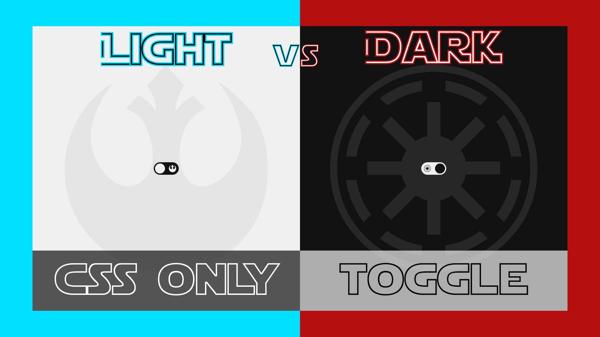
Simple Dark/Light Mode Theme Toggle (CSS ONLY) | UI Design
There are several ways that we can implement themes. Generally, these only choose between light and dark mode, but any color scheme could be a choice.
In the next several articles I'm going to show you the different ways that you can accomplish this. There will also be some extra cool things thrown in throughout each article. So be sure to read to the end.
The example that we'll build today is probably the easiest way to implement a mode picker.
HTML
We'll start with the HTML:
The HTML is very simple, but pay attention to the way in which it is layed out. We start with the input so that we can use CSS selectors to target all of the elements after it. This is very important.
This example uses FontAwesome, so be sure to include the `.css` CDN.
CSS
We'll start with some custom properties and resets:
We'll be manipulating the custom properties later on by using the checkbox.
The content class will be our main "wrapper" for everything.
Next, we'll hide the checkbox. Since we linked the `label` to the checkbox, we will be able to toggle it by clicking on the label.
Now we'll style the label:
We are setting up transitions for the colors and position of the ball because we will be changing those later on. We want these to have smooth animations.
Next, the background image will change dependent on the theme. Here are the styles for the images:
And lastly, we'll set the actions that will occur when the checkbox is checked:
That's it!
Again, this is the first in a series of four articles that will show you different methods that you can implement to achieve theming in your project.
Reference
Check out the full video on my YouTube channel.
Help me out by liking this video and subscribing if you haven’t already.